Marcelo Paiva

Selected work

Marcelo Paiva

Design engineer

I build design systems that let people and AI ship accessible products. I have spent two decades on enterprise software, from financial markets platforms at Thomson Reuters to HR and talent systems used by frontline workers. The systems live in code that engineers want to use, and I use AI coding agents every day to get designs into production faster.

ClearCo: rebuilding a research and design team for agents

Agents write a serious share of our code, which only works because the material they draw from is readable, testable and checkable. I built that first, and I am still rebuilding a traditional research and design team into one that ships production code through the same gate as the engineers.

Role
Head of UX and accessibility — product, design and engineering; one of the leads of the AI transformation
Year
2024–present
Built with
TypeScript, React, Design systems, WCAG 2.2 AA, TDD, AI agents, Vite, Design tokens, Retrieval, citations
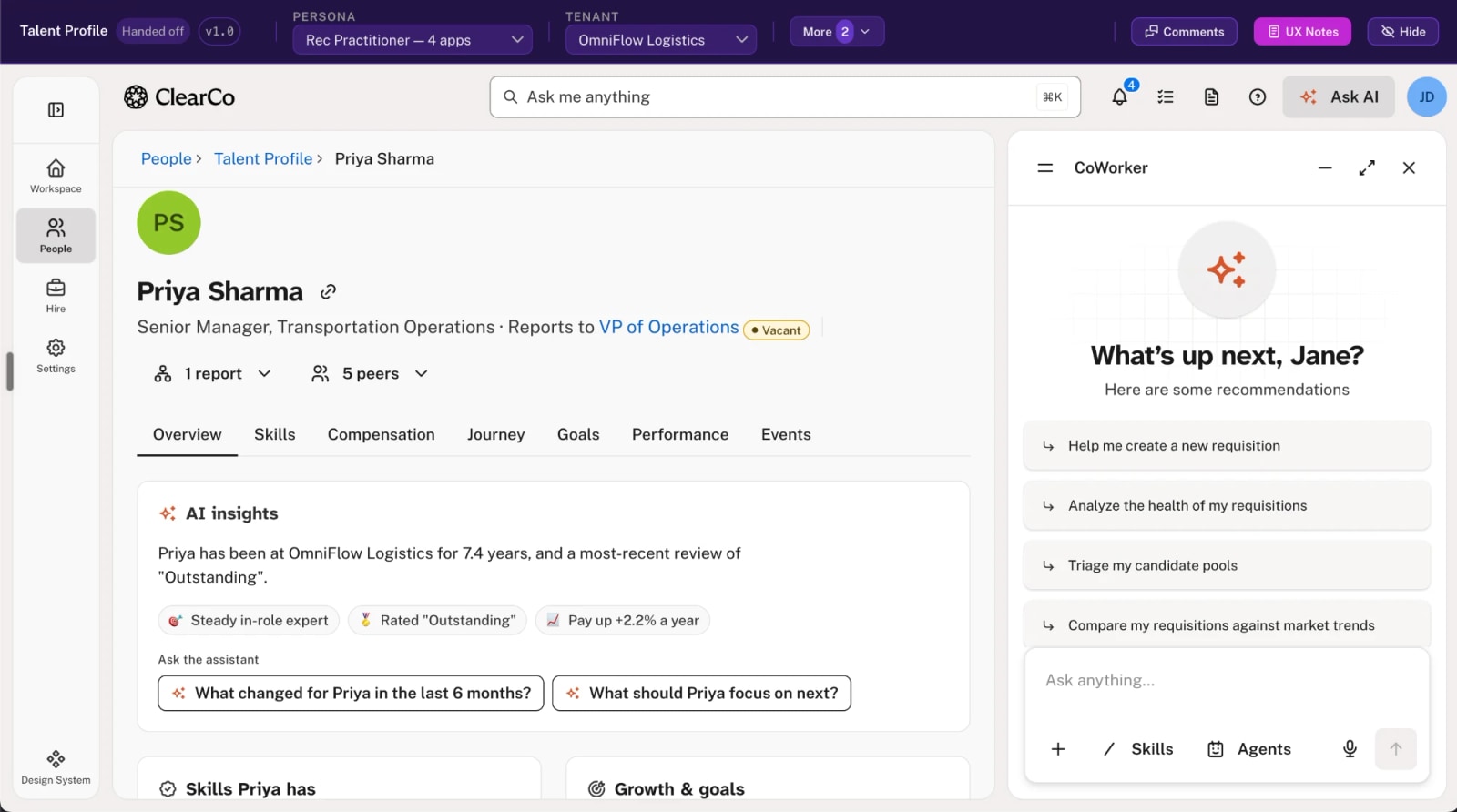
The talent profile running inside the prototype harness. A review bar across the top carries the screen name, a Handed off badge at version 1.0, and two dropdowns that change the whole application underneath it: persona, set to Rec Practitioner with four apps, and tenant, set to OmniFlow Logistics. Beside them sit buttons for comments and UX notes. Below that is the product itself — a left rail of Workspace, People, Hire and Settings with Design System at the foot, an Ask me anything search field, and the profile of Priya Sharma, Senior Manager of Transportation Operations, reporting to a VP of Operations marked Vacant. Seven tabs run from Overview to Events. An AI insights card reduces seven point four years in role and an Outstanding review to three chips, then offers two questions to put to the assistant. A CoWorker panel on the right opens with What's up next, Jane? over four suggested actions and an Ask anything field.
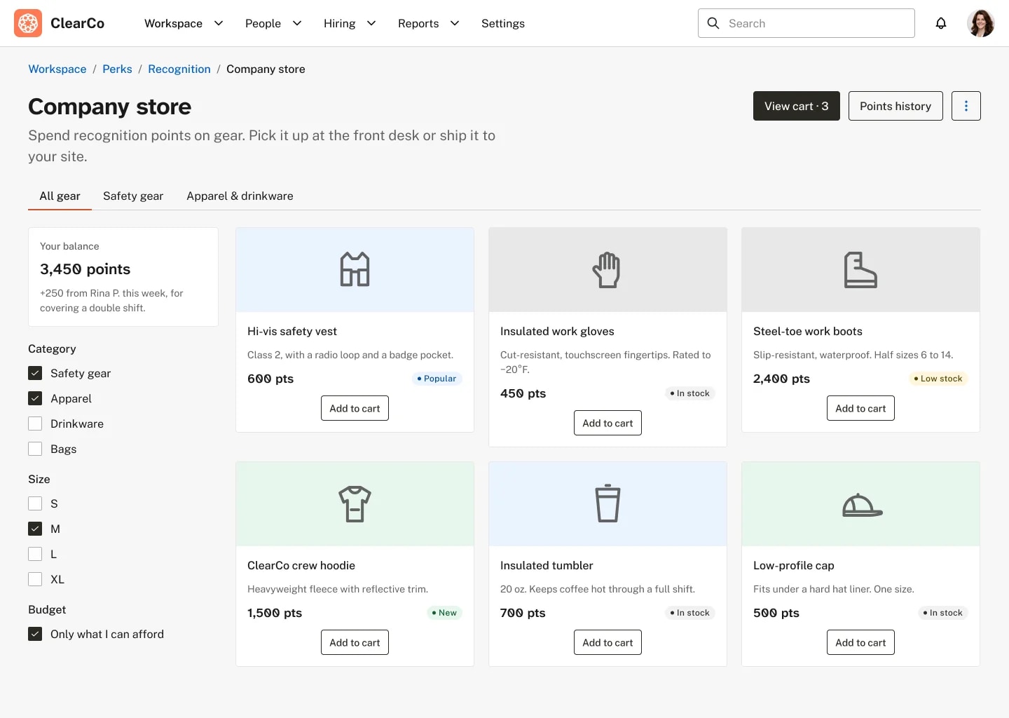
  • A company store where employees spend recognition points. A balance card reads 3,450 points, with 250 added this week from a colleague for covering a double shift. Filters below it cover category, size, and a ticked option to show only what the balance can buy. Six product cards fill the grid, each with an outline illustration, a name, one line of description, a points price and a stock badge: a hi-vis vest (600, Popular), insulated gloves (450), steel-toe boots (2,400, Low stock), a crew hoodie (1,500, New), an insulated tumbler (700) and a low-profile cap (500), each with Add to cart.
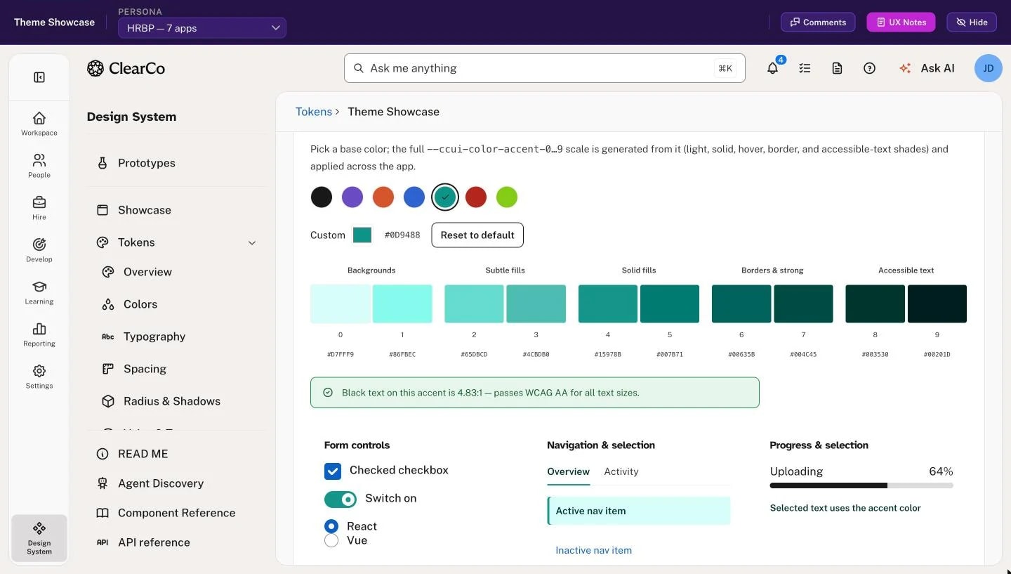
  • The theme showcase with a teal accent picked from a row of seven swatches, its custom value reading #0D9488. From that one color the page has generated a ten-step scale, numbered 0 to 9 and grouped as backgrounds, subtle fills, solid fills, borders and accessible text, each step with its hex value. A green notice under the scale reads: black text on this accent is 4.83:1, passing WCAG AA for all text sizes. Below it, form controls, tabs, an active nav item and a progress bar have already taken the new color.
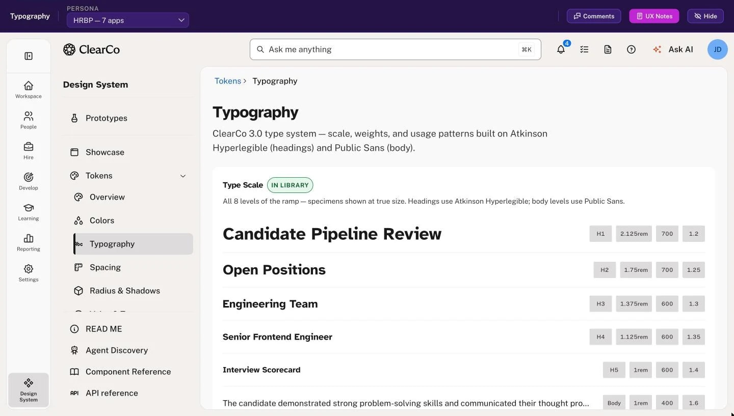
  • The typography page of the design system, describing the 3.0 type system as Atkinson Hyperlegible for headings and Public Sans for body. A type scale tagged In library shows each level at true size with its role, size, weight and line height: Candidate Pipeline Review as H1 at 2.125rem, Open Positions as H2, Engineering Team as H3, Senior Frontend Engineer as H4, Interview Scorecard as H5, then a line of body text from an interview note.
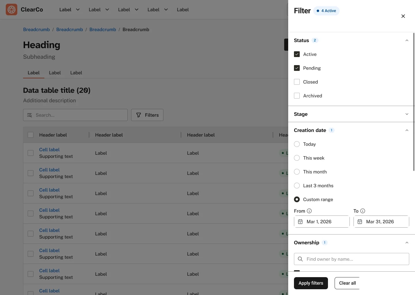
  • A data table dimmed behind a filter drawer that has slid in from the right. The drawer's title carries a badge reading 4 Active. Under Status, Active and Pending are ticked and Closed and Archived are not, with a count of 2 beside the heading. Stage is collapsed. Creation date, counted 1, is set to Custom range, from Mar 1, 2026 to Mar 31, 2026, below the presets Today, This week, This month and Last 3 months. Ownership opens on a field for finding an owner by name. Apply filters and Clear all sit at the foot.
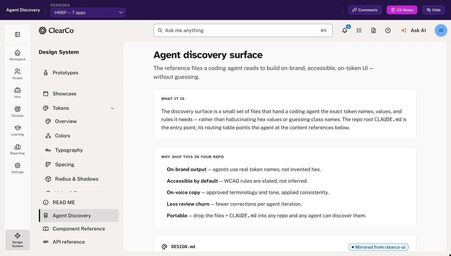
  • A page titled Agent discovery surface: the reference files a coding agent reads to build on-brand, accessible, on-token UI without guessing. A first panel explains that a small set of files hands the agent exact token names, values and rules instead of letting it invent hex values, with the repository's CLAUDE.md as the entry point. A second lists why to ship it: on-brand output, accessible by default, on-voice copy, less review churn and portability. The first file card, DESIGN.md, is marked as mirrored from clearco-ui.
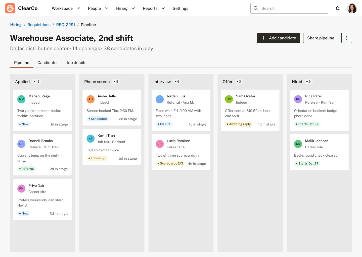
  • A hiring pipeline for a Warehouse Associate, 2nd shift requisition at the Dallas distribution center: 14 openings, 38 candidates in play. Under Pipeline, Candidates and Job details tabs, five columns run from Applied (12) through Phone screen (8), Interview (6) and Offer (3) to Hired (9). Each card carries a candidate's initials, name and source (Indeed, a referral, the career site, a job fair), one line on where they stand, a status badge and days in the stage. Aisha Bello's screen is booked for Thursday at 2:30 PM, Sam Okafor's offer has gone out at $19.50 an hour and is awaiting a reply, and two hires start Oct 27.
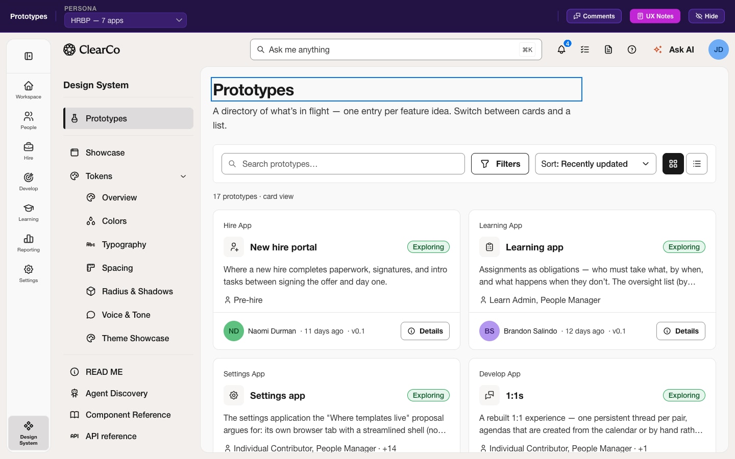
  • The sandbox running. A purple prototype bar across the top carries a persona switcher set to the HR business partner, who has seven apps, with buttons for comments, UX notes and hiding the bar. Under it sits the full application chrome: an icon rail for Workspace, People, Hire, Develop, Learning, Reporting and Settings, a Design System panel listing Prototypes, Showcase, Tokens, Components, Organisms and Patterns, and a directory of seventeen prototypes as cards — each naming its app, its status, the personas it is for, who last touched it and its version.
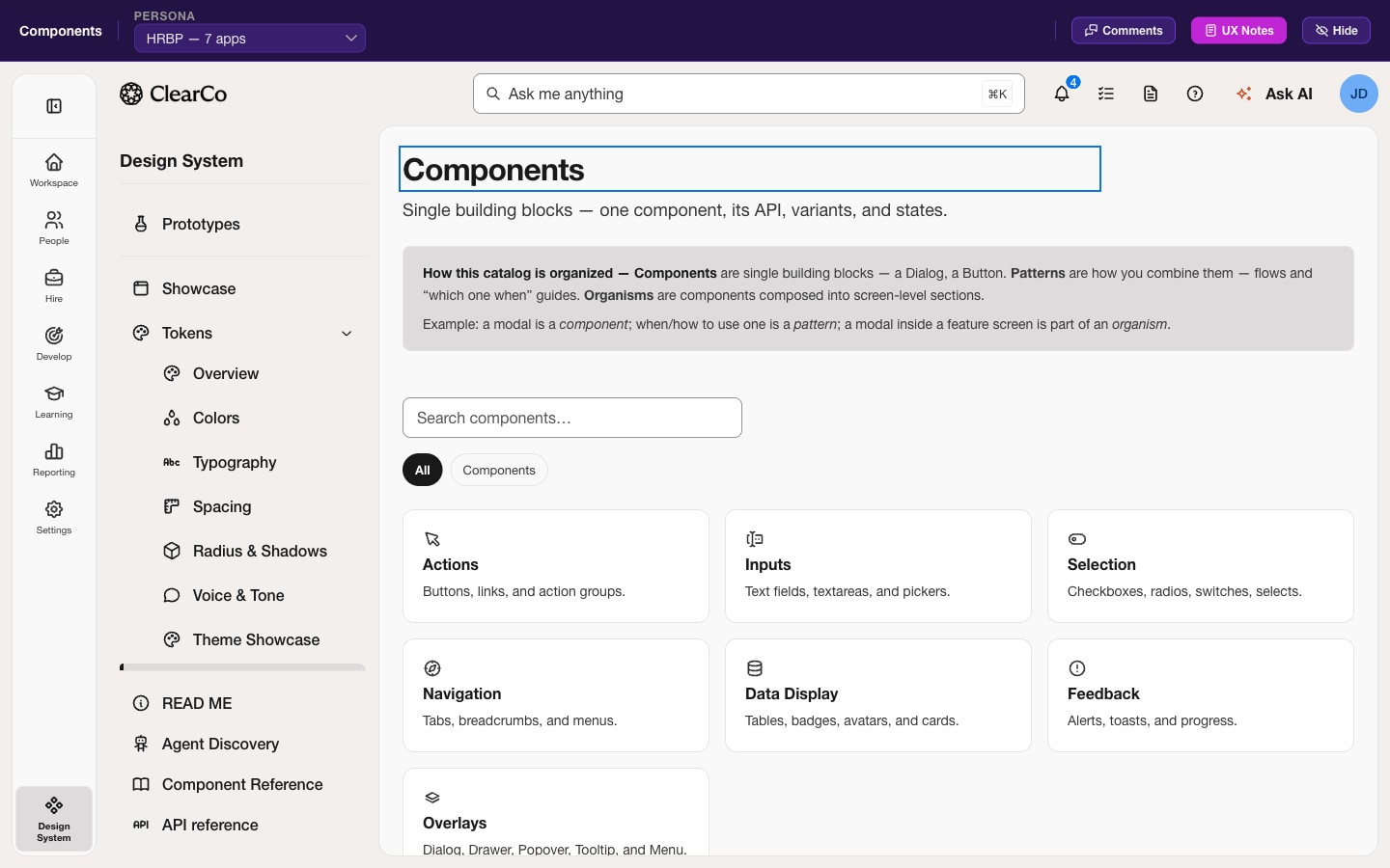
  • The component catalog, which explains its own organization before it lists anything: components are single building blocks, patterns are how you combine them, organisms are components composed into screen-level sections. Seven category cards follow — Actions, Inputs, Selection, Navigation, Data Display, Feedback and Overlays — each naming what it holds.

UKG: asking 184 customers what they were trying to get done

A Jobs To Be Done survey of the recruiting customer base, run to find where investment would move satisfaction and where it would not. Sixteen interviews became 201 outcome statements; 184 people rated every one of them twice. Commissioned and co-authored by me.

Role
UX manager — commissioned the study, co-authored the enterprise analysis
Year
2019–2020
Built with
Jobs To Be Done, Outcome-Driven Innovation, Survey design, Contextual interviews, Research leadership
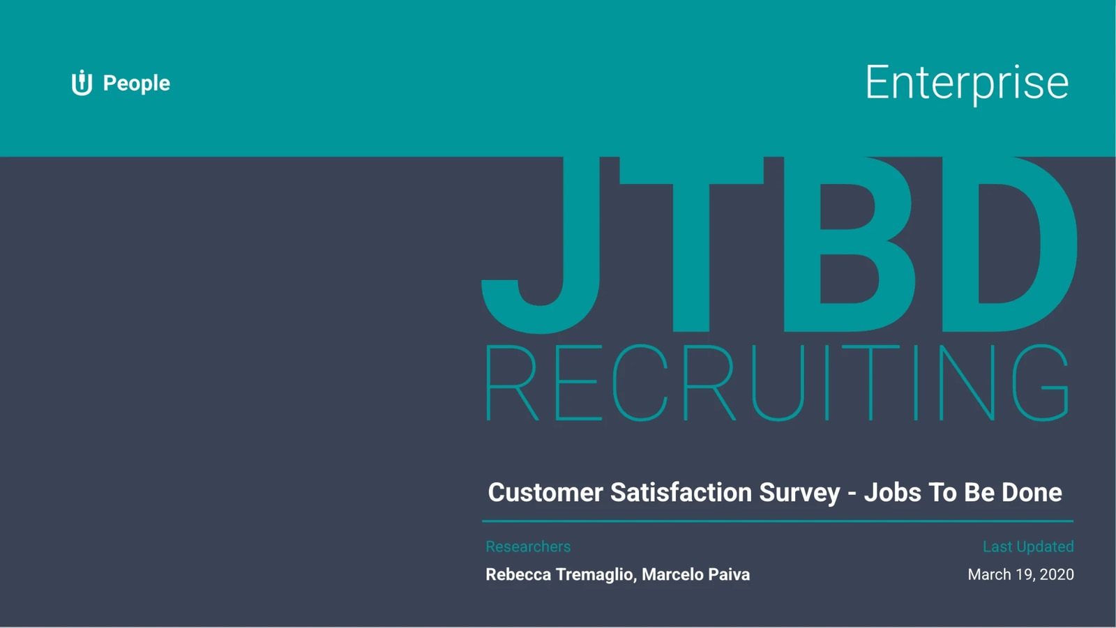
The cover of the enterprise cut of the study. A teal band across the top carries the Ultimate Software People mark on the left and the word Enterprise on the right. Below it, on a slate field, JTBD is set large in solid teal with RECRUITING outlined beneath. The title reads Customer Satisfaction Survey - Jobs To Be Done, over a rule, and under that two columns: Researchers, naming Rebecca Tremaglio and Marcelo Paiva, and Last Updated, reading March 19, 2020.

Putting WCAG where the code gets written

Open-source accessibility tooling for AI coding environments: WCAG in the statusline, WCAG as an MCP server, and contrast enforcement inside a coding agent runtime. Plus a cockpit that plans, hires and verifies a team of agents, documented on one real run of nine checks, fourteen minutes and $1.98.

Role
Open source — author and contributor
Year
2026
Built with
TypeScript, MCP, Terminal UI, WCAG 2.2, Multi-agent orchestration
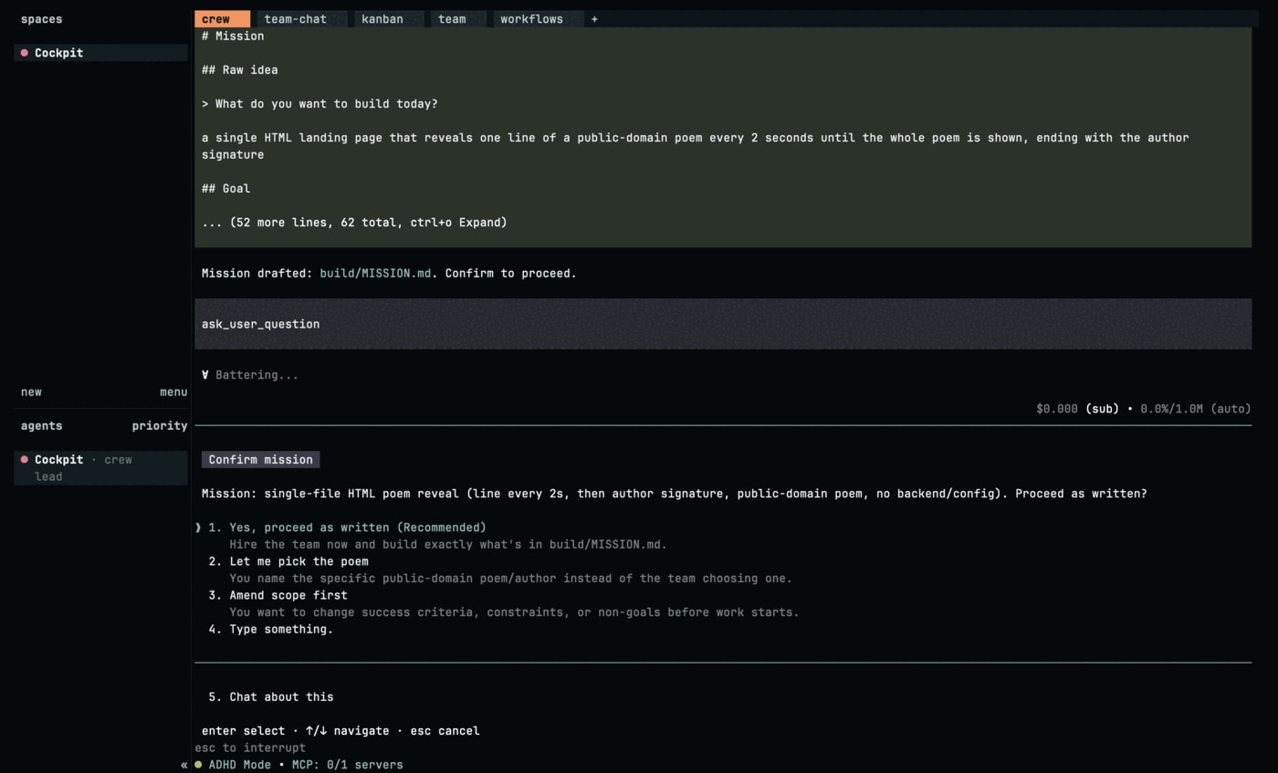
The approval gate, before a single agent is hired. The mission has been drafted to a file and the interface asks whether to proceed as written, offering four numbered choices: proceed and let the team build exactly what the mission file says; pick the poem yourself instead of letting the team choose; amend the scope first to change success criteria, constraints or non-goals; or type something else. A fifth option opens a conversation about it. The footer reads enter select, up and down navigate, escape cancel.
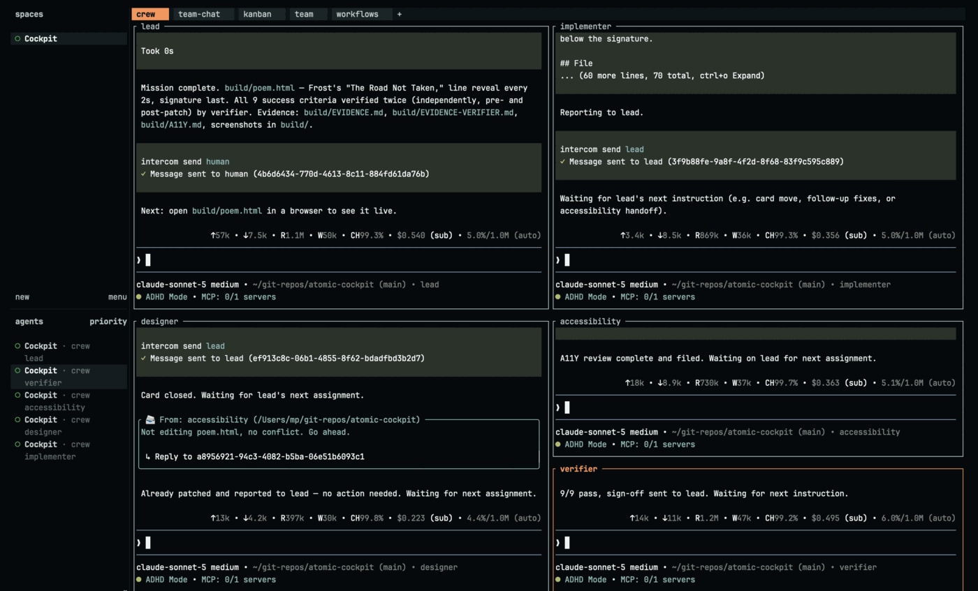
  • The end of the same run. The lead reports the mission complete, names what was built, and states that all nine success criteria were verified twice — independently, and both before and after the patch — by the verifier, listing the evidence files written along the way. In the bottom right the verifier's own pane reads "9/9 pass, sign-off sent to lead". A message has gone to the human.
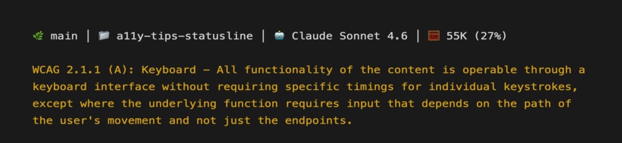
  • A terminal statusline carrying a WCAG tip. The top row is the ordinary status: the branch, the folder, the model in use, and the context at 55K or 27 percent. Underneath, in amber, sits success criterion 2.1.1 Keyboard quoted in full — that all functionality must be operable through a keyboard interface, without requiring specific timings for individual keystrokes.

WCAG Plugin for Figma

A free, open-source Figma plugin that puts WCAG guidance, annotation cards and accessibility utility tokens inside the file where design decisions actually get made. 10,500 users on Figma Community, and one feature they could not find.

Role
Designed, built and shipped
Year
2024
Built with
TypeScript, Figma Plugin API, Design tokens
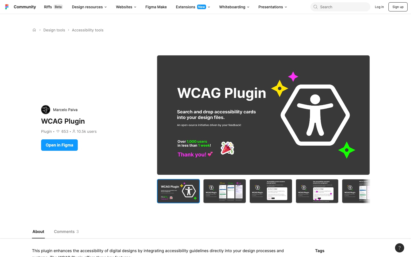
The plugin on the Figma Community, credited to Marcelo Paiva and listed under Accessibility tools. It shows 653 likes and 10.5 thousand users beside an Open in Figma button. The cover reads "WCAG Plugin — Search and drop accessibility cards into your design files", over a large outlined accessibility figure, with a note that it passed a thousand users in under a week. A filmstrip of five more screens sits below it.

WTFocus: a focus ring you can check instead of argue about

A tool for designing focus indicators that tells you, while you are still choosing, whether the one you drew passes WCAG 2.2 Focus Appearance. Built to support a symposium paper that took Best Presentation. Design mine, code my son's.

Role
Design
Year
2020
Built with
Accessibility, WCAG 2.2, Focus appearance, Open source
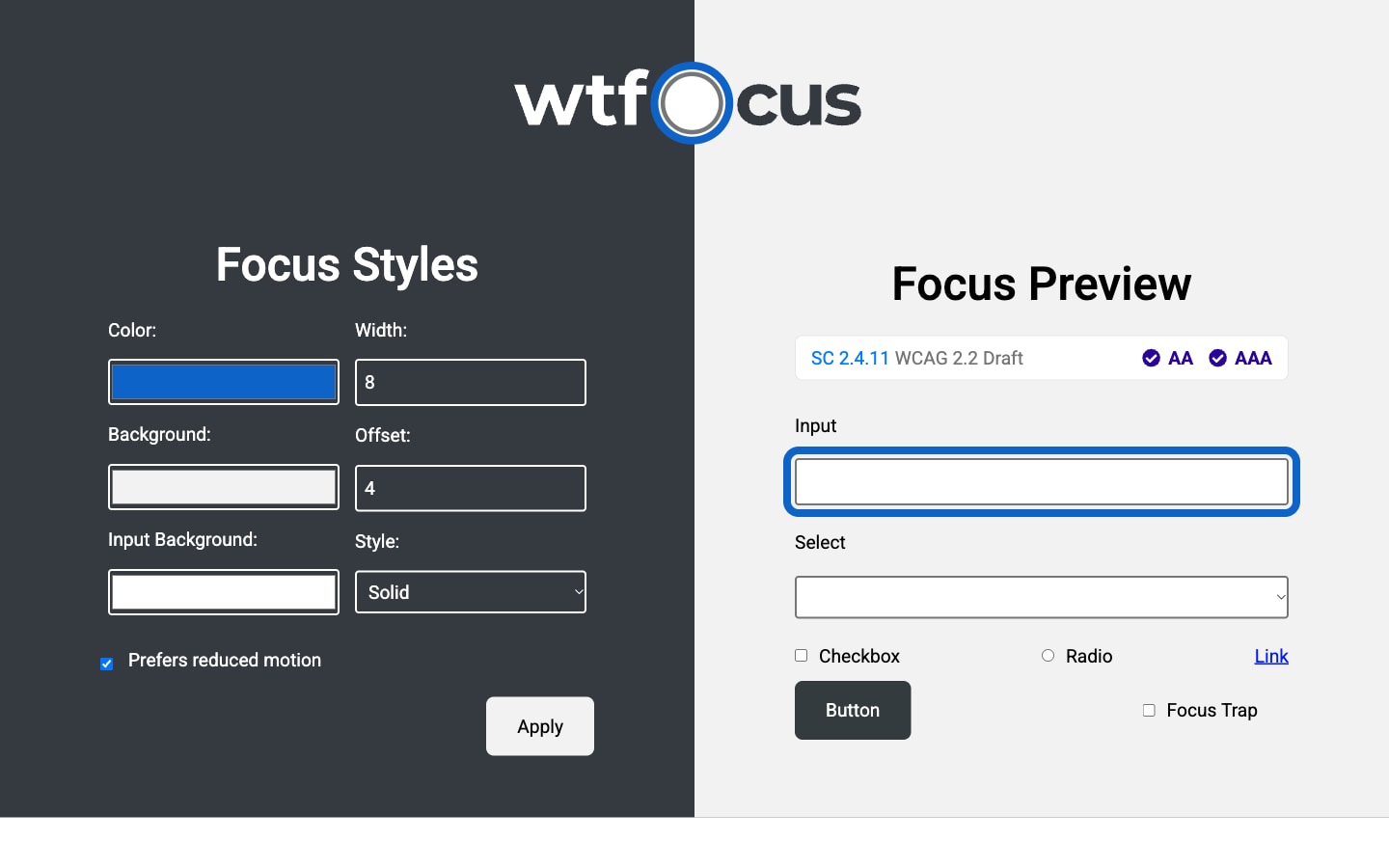
The tool in two halves. On the dark left panel, Focus Styles: color swatches for the ring, the background and the input background, number fields reading width 8 and offset 4, a style dropdown set to Solid, a checked Prefers reduced motion box, and an Apply button. On the pale right panel, Focus Preview: a bar naming SC 2.4.11 WCAG 2.2 Draft with AA and AAA both ticked, then a text input carrying a thick blue focus ring held clear of its edge, and below it a select, a checkbox, a radio, a link, a button and a focus trap toggle.
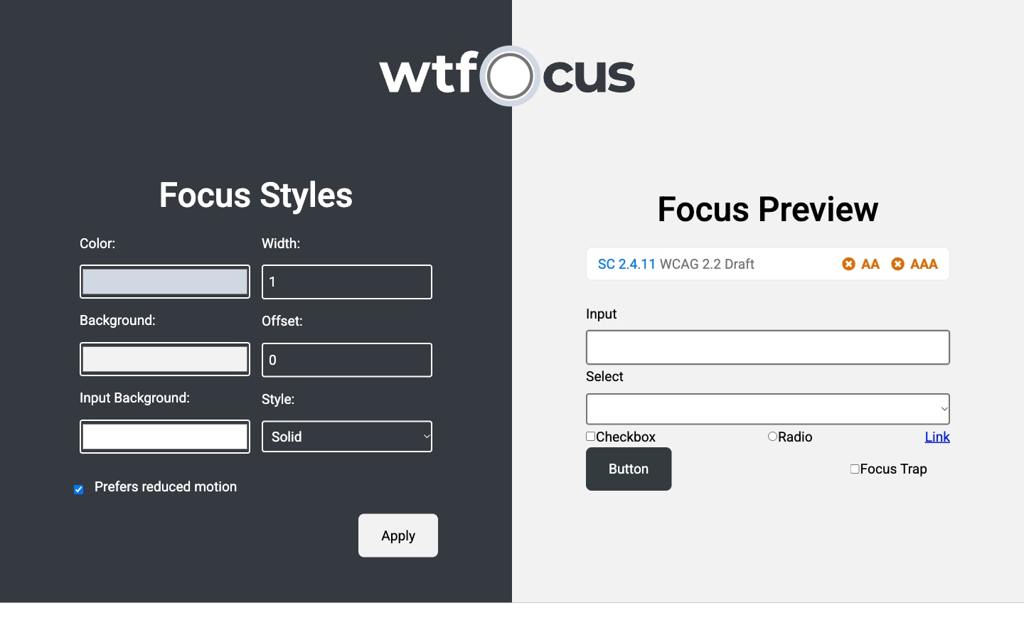
  • The same tool with a failing style applied. Width is 1, offset is 0, and the color swatch is pale gray-blue. In the preview the SC 2.4.11 bar now shows AA and AAA each marked with an orange cross, and the text input below carries a hairline ring barely separable from its own border.
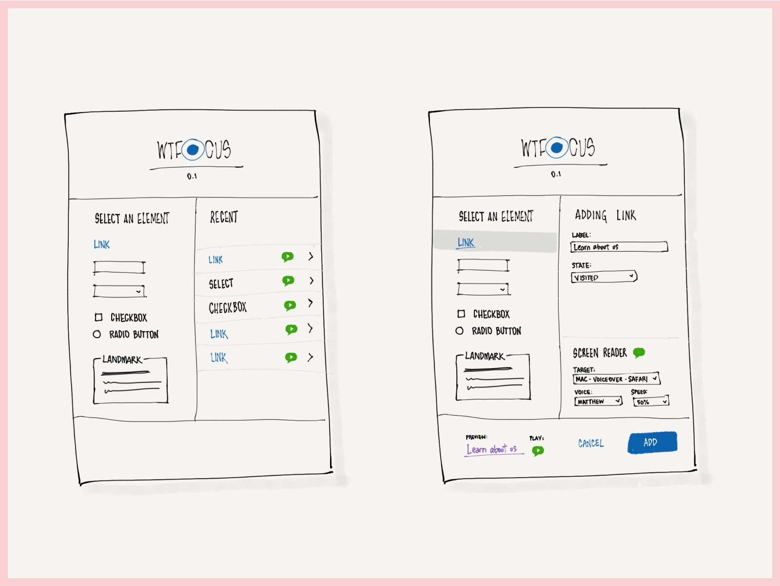
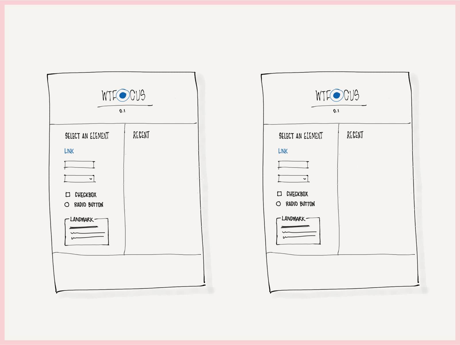
  • Two sketched screens for a tool called WTFocus, version 0.1. The left pane lists selectable elements — link, input, select, checkbox, radio button, landmark. The right pane configures a link's label and state, and chooses a screen reader target, voice and speed, with a preview and play control.
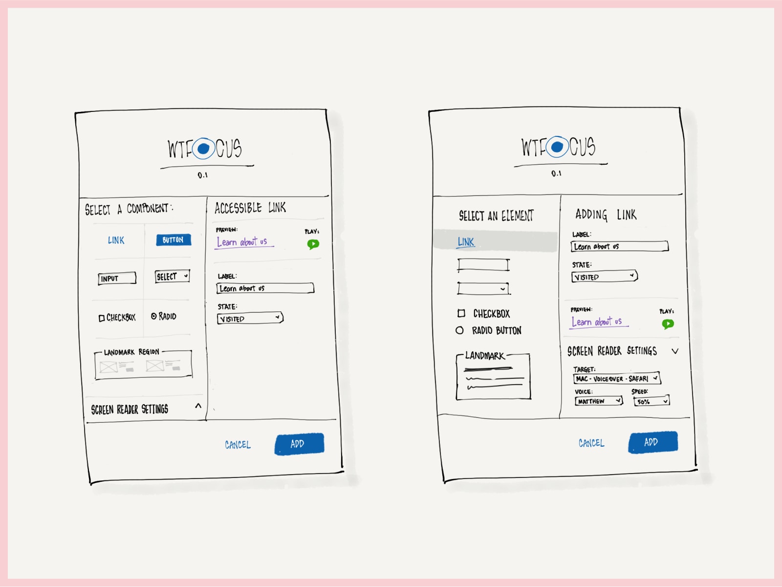
  • Two layout explorations for WTFocus. One presents components as a grid with an accessible link panel beside it; the other keeps a vertical element list with the screen reader settings collapsed under the configuration panel.
  • Two nearly identical WTFocus layouts in their empty state, with an element list on the left and an empty Recent panel on the right, used to compare spacing and proportion.
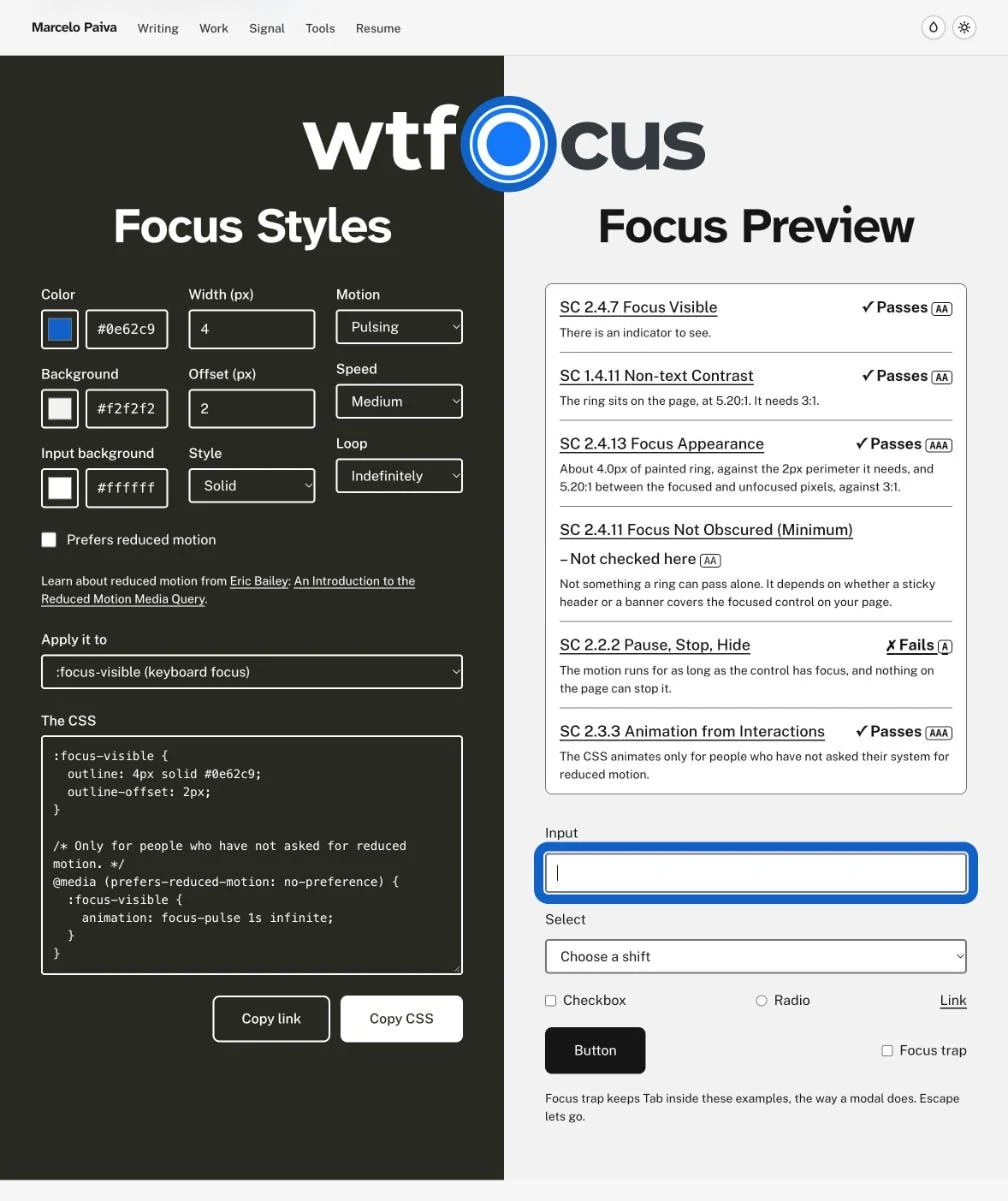
  • The rebuilt WTFocus in the original's layout. The wtfocus logo, its O a focused radio button, stands across the seam between two halves. On the dark Focus Styles side: color, background and input background in one column, width 4, offset 2 and Solid in the next, and a third column that appears once Prefers reduced motion is cleared, set to Pulsing, Medium and Indefinitely. Below are links on reduced motion, a selector set to :focus-visible, the CSS with its animation wrapped in a prefers-reduced-motion query, and Copy link and Copy CSS buttons. On the pale Focus Preview side, a card lists the criteria: 2.4.7, 1.4.11 and 2.4.13 pass, 2.4.11 is not checked here, 2.2.2 Pause, Stop, Hide fails because the motion never stops, and 2.3.3 passes. Under it the Input wears a thick blue ring mid-pulse, above a select, a checkbox, a radio, a link, a button and the Focus trap checkbox.

Great Place To Work Hub: turnover and belonging, read together

The future vision for reading an organization's demographic record and its belonging survey side by side — so that a turnover number becomes a sentence about a specific group of people.

Role
Product design lead
Year
2023
Built with
Design systems, Data visualization, HCM
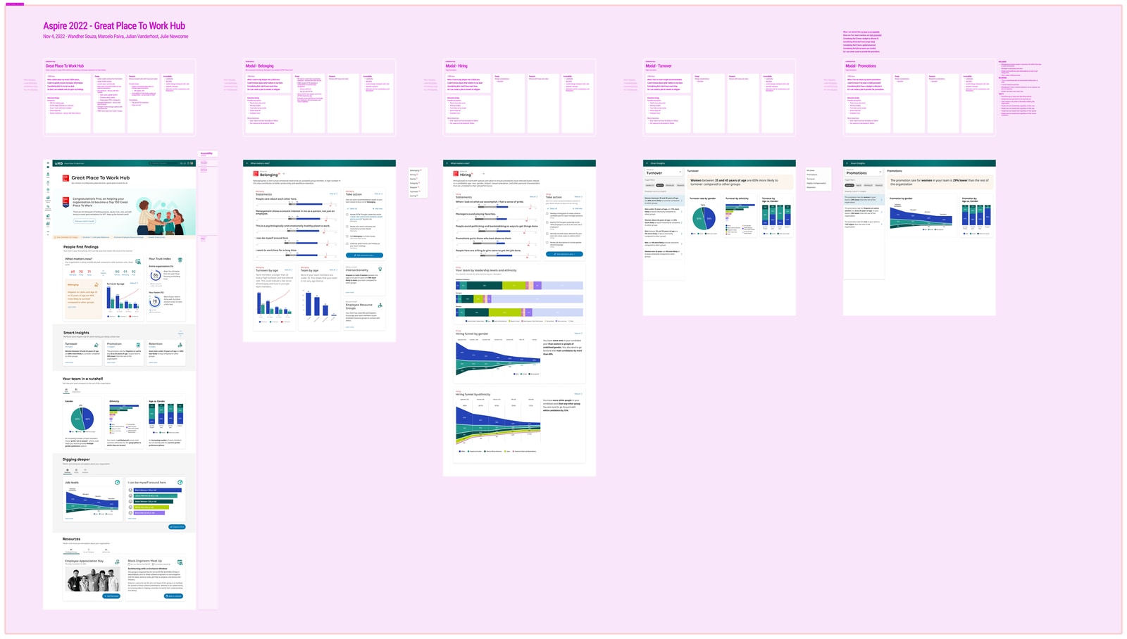
The project's Figma board, titled Aspire 2022 Great Place To Work Hub, dated November 2022. A row of specification frames sits above the screen designs they describe, covering the hub and its Belonging, Hiring, Turnover and Promotions modals.
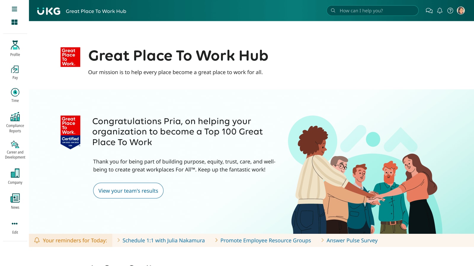
  • The hub landing screen inside UKG, with a Great Place To Work certified badge and a banner congratulating the user on helping their organization reach the Top 100. A reminders bar along the bottom suggests scheduling a one-to-one, promoting employee resource groups and answering a pulse survey.
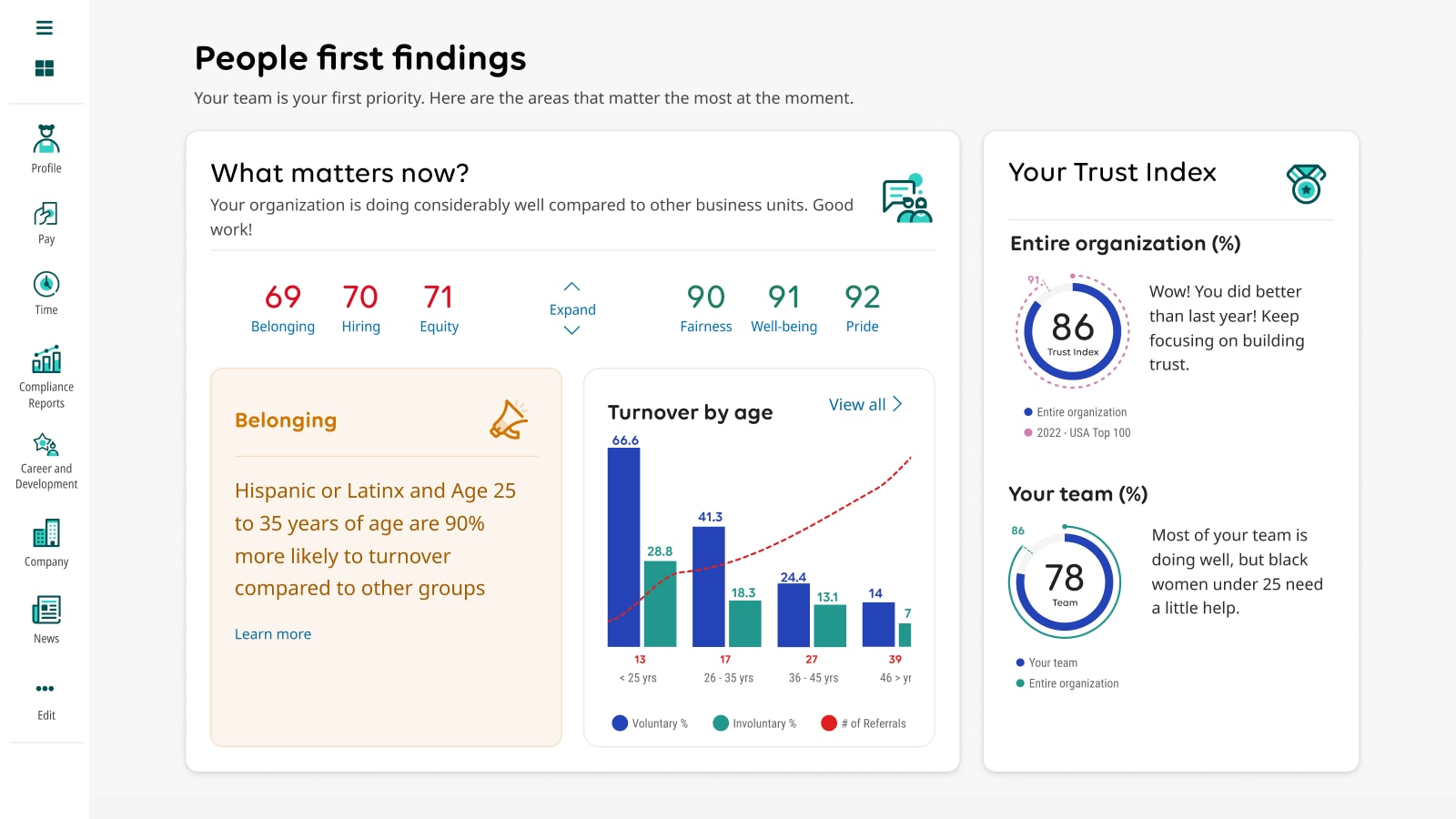
  • A People first findings screen. Six scores run from Belonging at 69 up to Pride at 92, color-coded from red to green. A highlighted Belonging card reports that Hispanic or Latinx employees aged 25 to 35 are 90 percent more likely to leave than other groups, beside a turnover-by-age bar chart and a Trust Index dial reading 86.
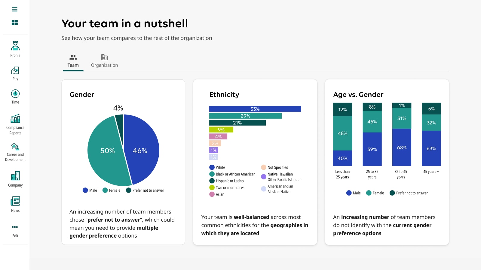
  • A Your team in a nutshell screen comparing a team against the wider organization across three charts: a gender pie, an ethnicity bar chart, and age versus gender as stacked columns. Each carries a plain-language reading, including that more team members are choosing prefer not to answer.
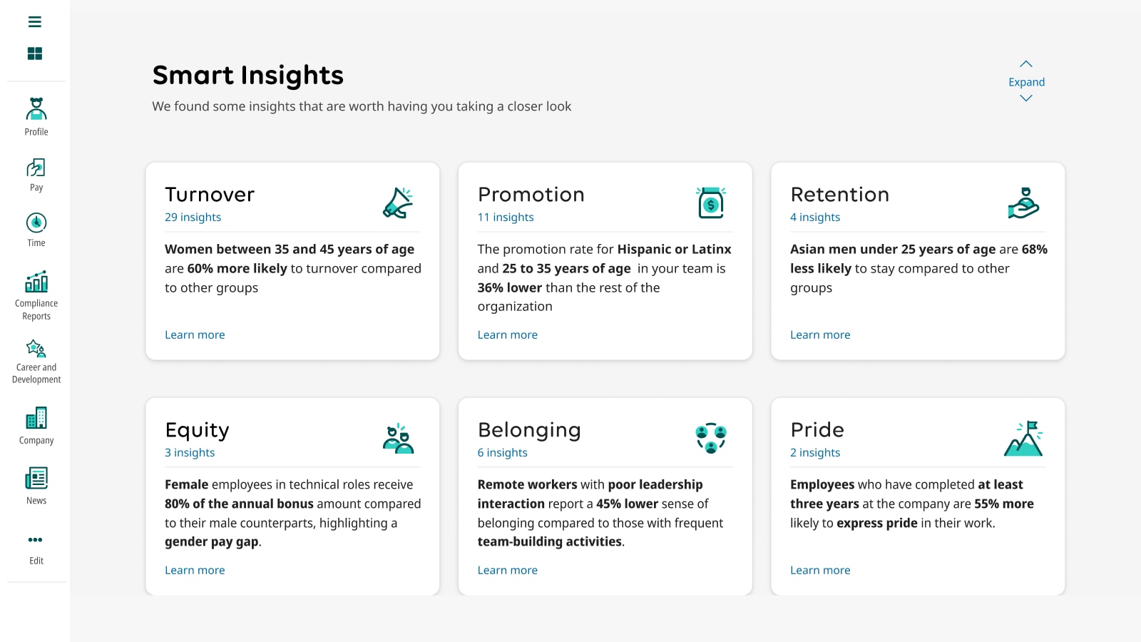
  • A Smart Insights screen of six cards — Turnover, Promotion, Retention, Equity, Belonging and Pride — each stating one finding in a sentence, such as women aged 35 to 45 being 60 percent more likely to leave, and female employees in technical roles receiving 80 percent of the bonus their male counterparts receive.
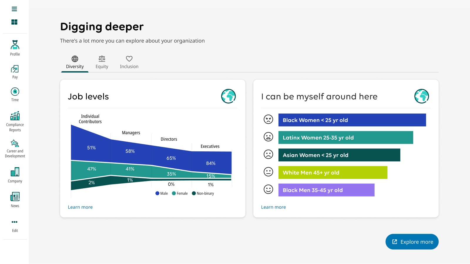
  • A Digging deeper screen on the Diversity tab. An area chart shows the share of men, women and non-binary employees at each job level, with women falling from 47 percent of individual contributors to 15 percent of executives. Beside it, an I can be myself around here chart ranks demographic groups by sentiment, with a face icon for each.
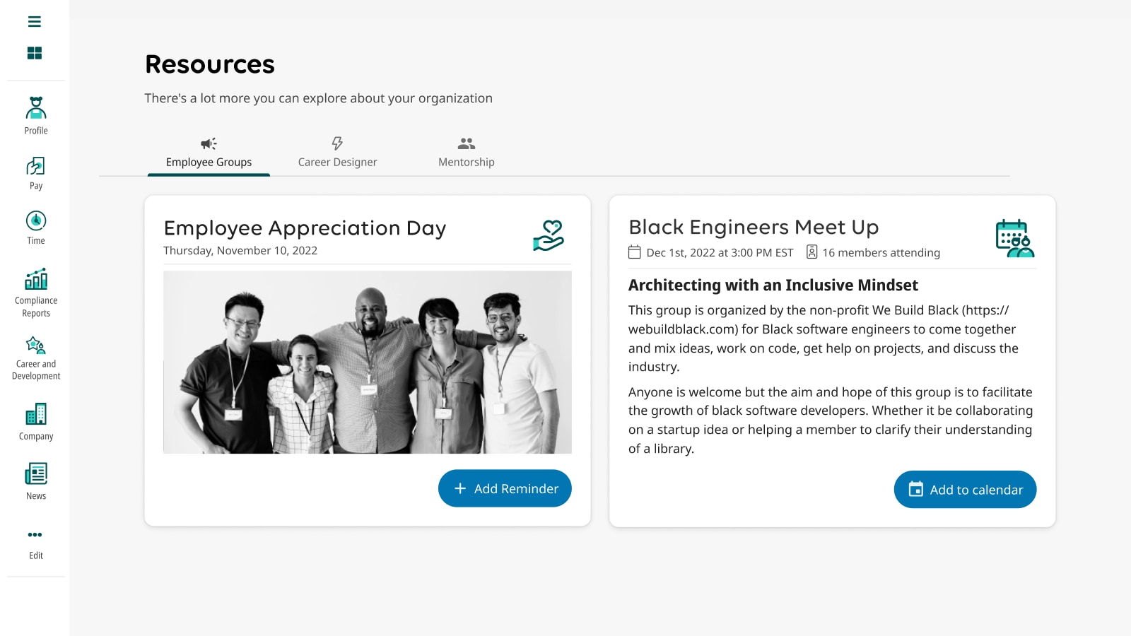
  • A Resources screen on the Employee Groups tab, showing an Employee Appreciation Day card with a photo of five colleagues, and a Black Engineers Meet Up card describing a session on architecting with an inclusive mindset.
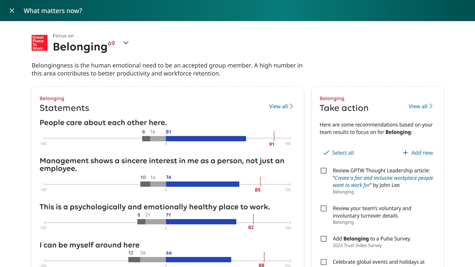
  • A full-screen Belonging panel. On the left, survey statements such as People care about each other here are plotted on a scale from minus 100 to 100, each with the team score and the benchmark marked in red. On the right, a Take action checklist recommends specific follow-ups.
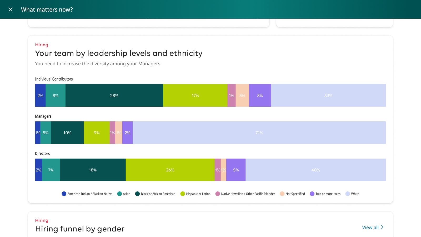
  • A chart of team composition by leadership level and ethnicity, as three stacked bars. White employees are 33 percent of individual contributors but 71 percent of managers, under a heading stating that diversity among managers needs to increase.
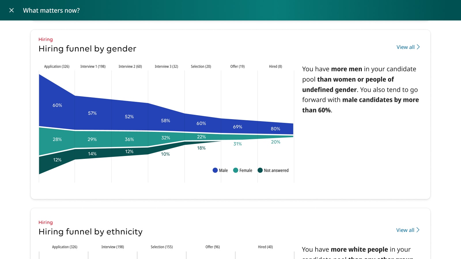
  • A hiring funnel broken down by gender across seven stages, from 326 applications to 8 hires. The male share rises from 60 percent at application to 80 percent at hire, with a note that male candidates are advanced more than 60 percent of the time.
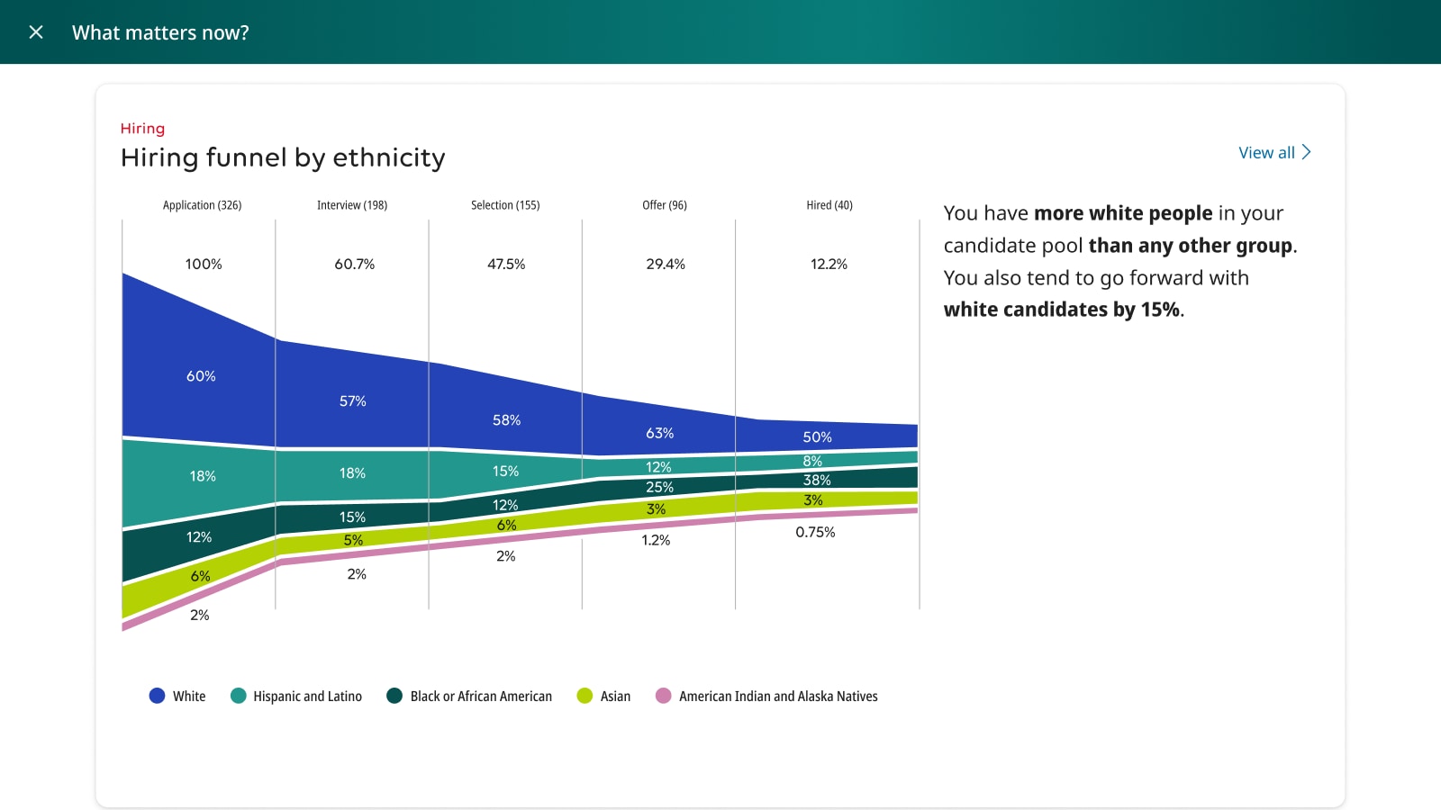
  • A hiring funnel broken down by ethnicity across five stages, from 326 applications to 40 hires. The white share of the pool grows through each stage, with a note that white candidates are advanced 15 percent more often than other groups.

Sketches

Paper-stage thinking across recruiting workflows, accessibility tooling and design system navigation — ideas at the point where they are still cheap to be wrong about.

Role
Facilitation and sketching
Year
2023
Built with
Design thinking
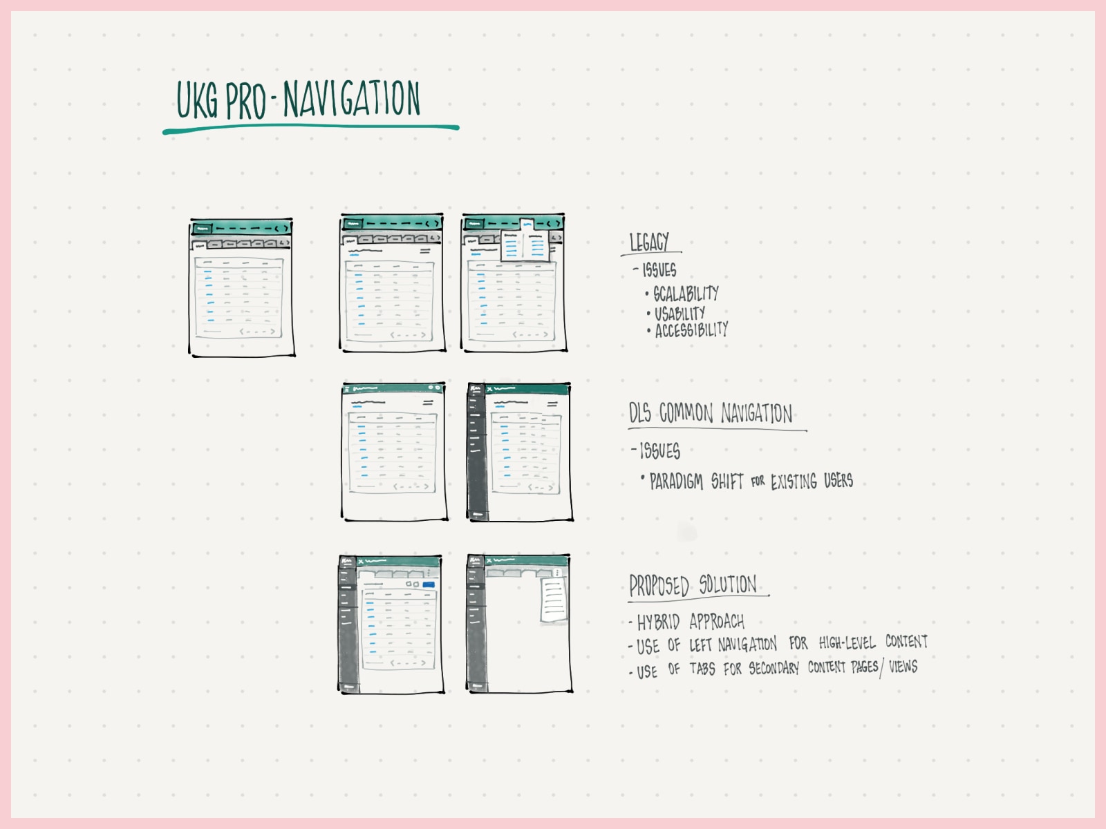
A sketch titled UKG Pro Navigation, comparing three navigation models. The legacy pattern is annotated with scalability, usability and accessibility problems; the design system's common navigation is marked as a paradigm shift for existing users; the proposed solution is a hybrid using left navigation for high-level content and tabs for secondary views.
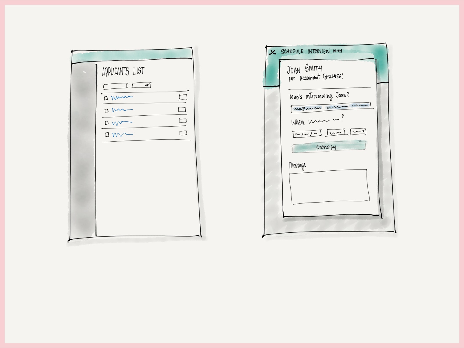
  • Two sketched screens for recruiting. On the left an applicants list with filters and a row of candidates. On the right a Schedule interview with Joan Smith panel for an accountant requisition, asking who is interviewing, collecting date and time, offering a Cronofy calendar connection, and providing a message field.
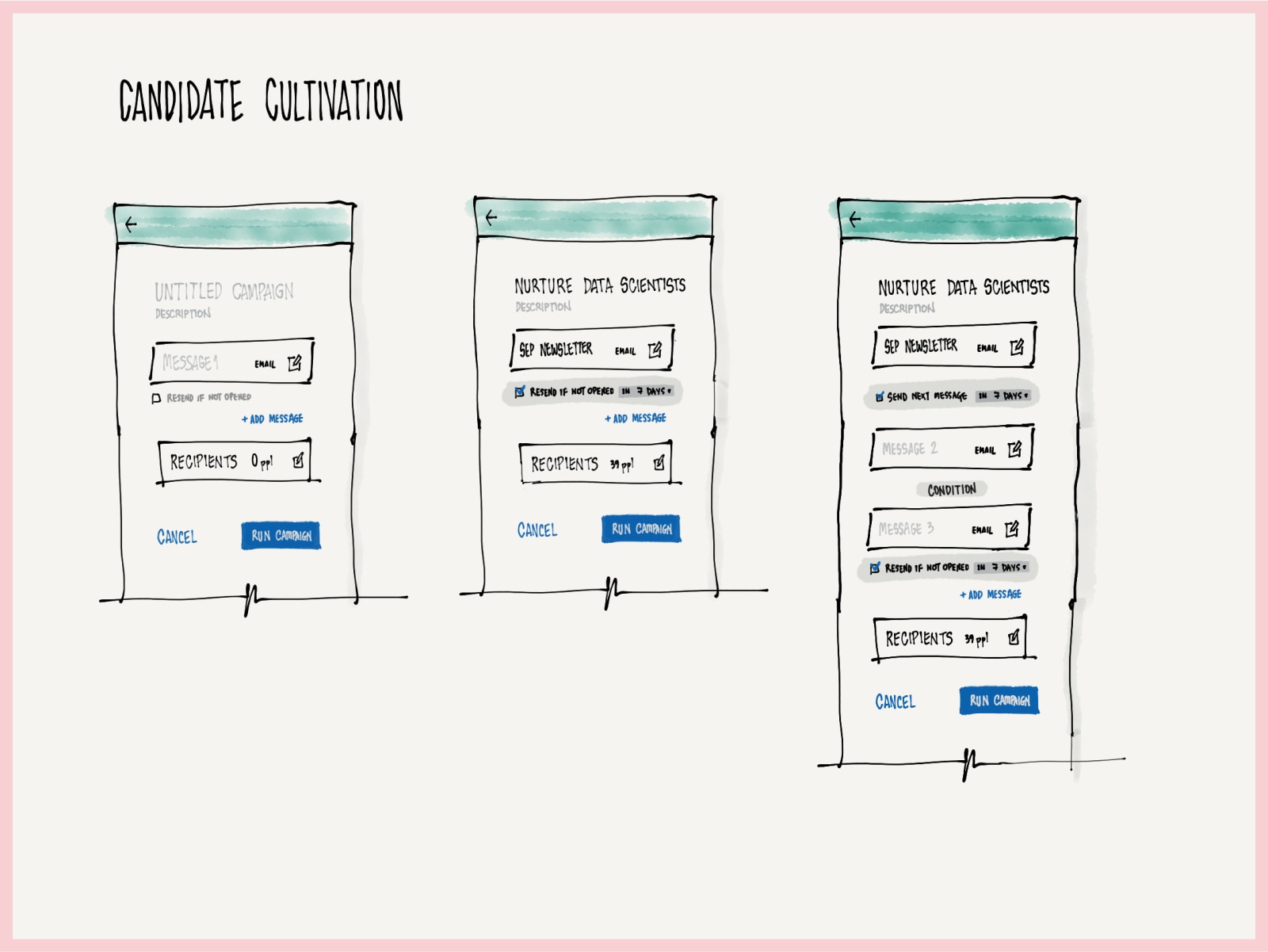
  • Three sketched states of a Candidate Cultivation campaign builder, progressing from an empty untitled campaign with one message, to a named Nurture Data Scientists campaign with 39 recipients, to a multi-step sequence with conditions and resend-if-not-opened rules between messages.
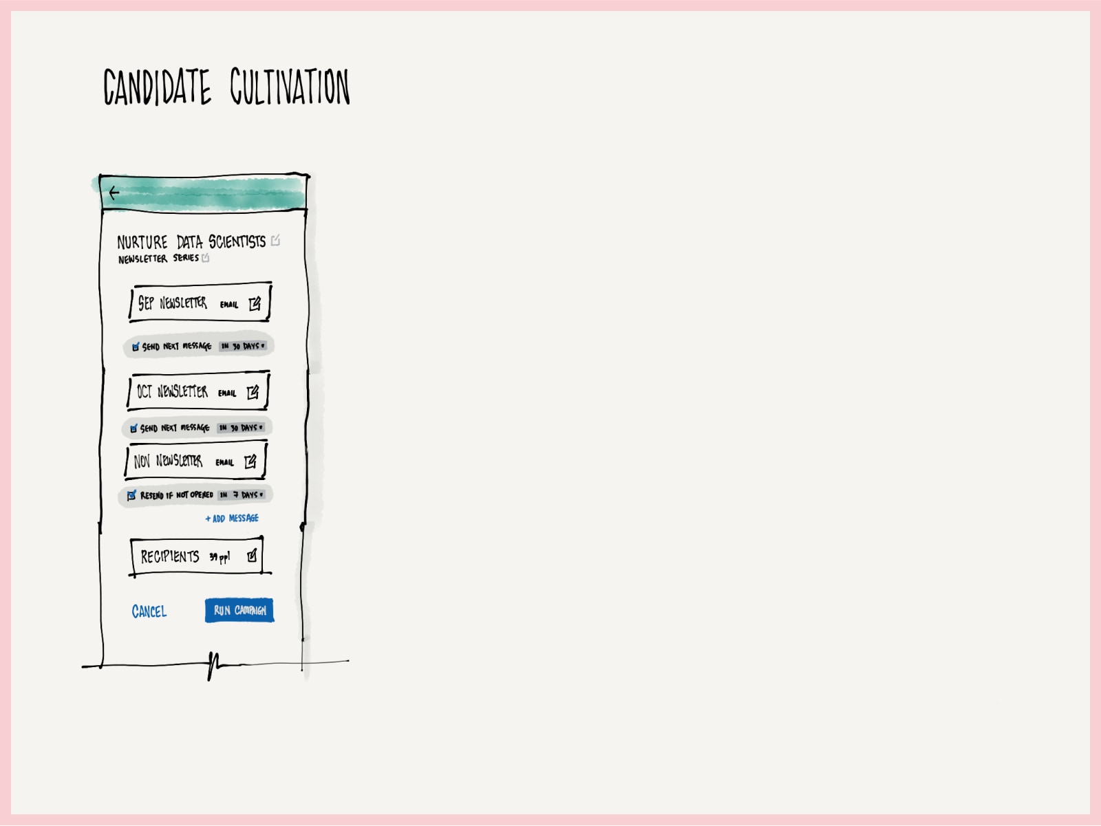
  • A sketched Candidate Cultivation screen showing a newsletter series: September, October and November messages chained by send-next-message rules set to 30 days, ending with a resend-if-not-opened rule and 39 recipients.
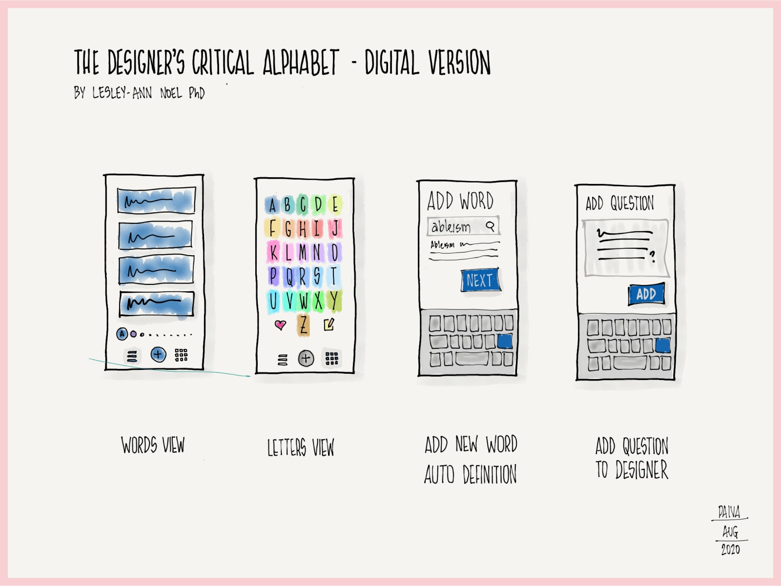
  • A sketch titled The Designer's Critical Alphabet, digital version, crediting Lesley-Ann Noel PhD. Four phone screens are labeled words view, letters view, add new word with automatic definition, and add question to designer. The letters view shows a colorful A to Z grid.
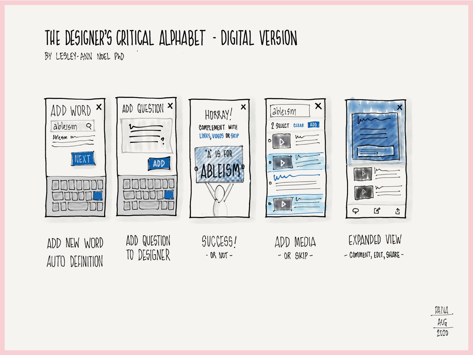
  • Five phone screens continuing the Critical Alphabet app: adding a word, adding a question, a success screen reading A is for ableism, adding media, and an expanded view offering comment, edit and share.
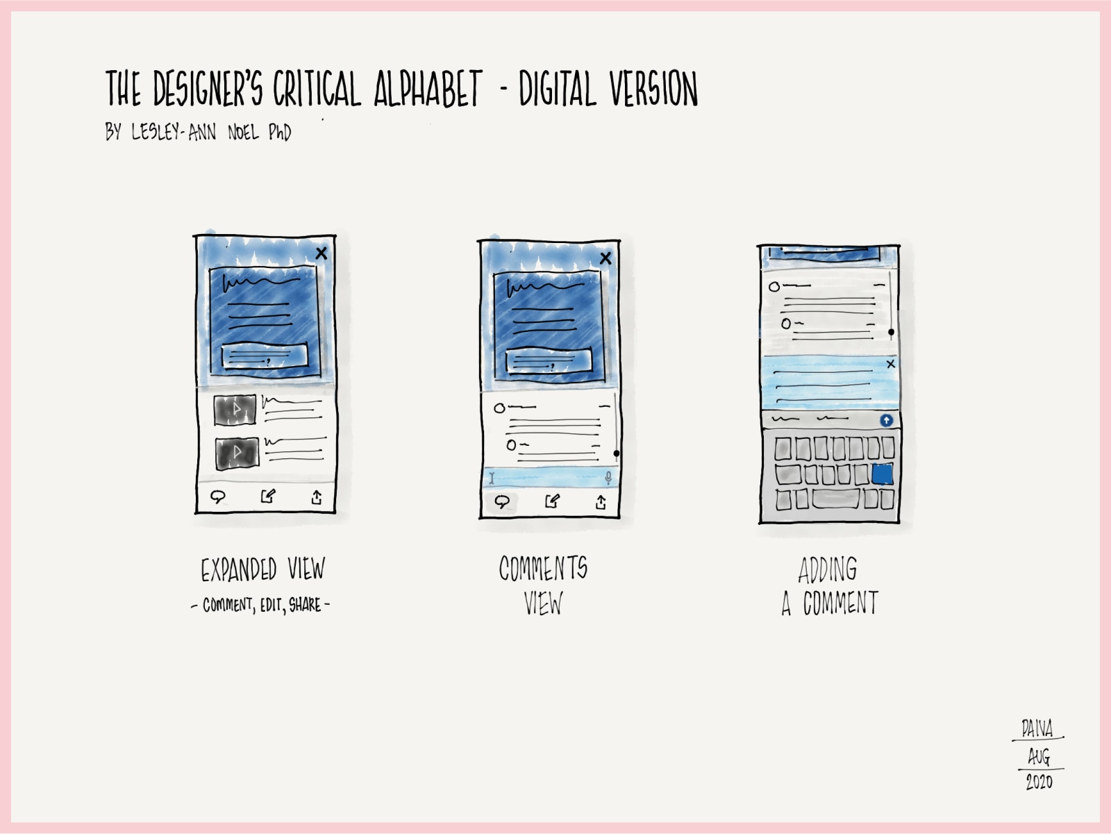
  • Three phone screens for the Critical Alphabet app showing the commenting flow: an expanded card with comment, edit and share actions, a comments view, and the keyboard open while a comment is typed.
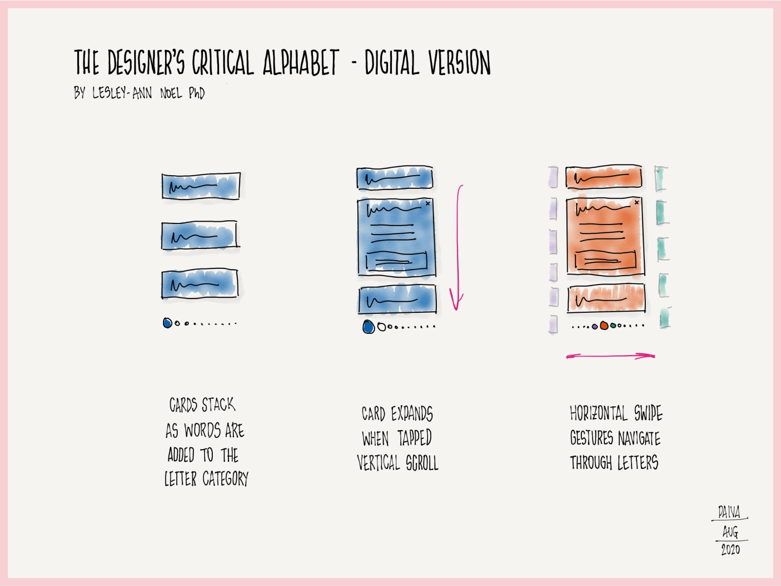
  • Interaction notes for the Critical Alphabet app, drawn as three diagrams with arrows: cards stack as words are added to a letter category, a card expands when tapped with vertical scrolling, and horizontal swipe gestures move between letters.
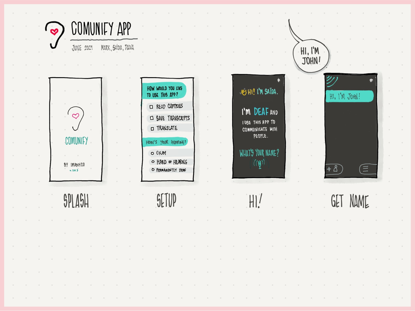
  • A sketch of the Comunify app, dated June 2021 and credited to Mark, Saïda and Paiva. Four phone screens cover a splash screen, a setup screen asking how the person wants to use the app and about their hearing, and two conversation screens where a deaf user introduces themselves and captures the other person's name.
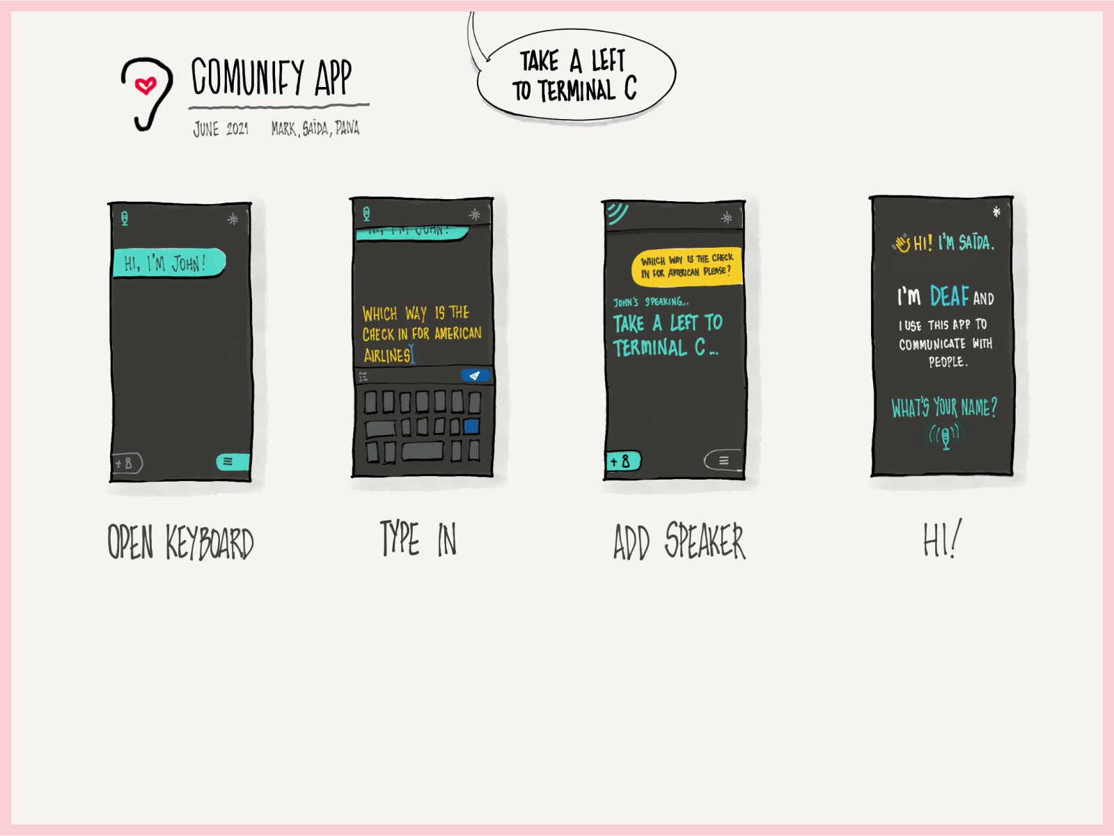
  • Four more Comunify app screens following a conversation in an airport: opening the keyboard, typing a question about the American Airlines check-in, adding a speaker whose reply is transcribed as take a left to terminal C, and the introduction screen.
  • Two sketched screens for a tool called WTFocus, version 0.1. The left pane lists selectable elements — link, input, select, checkbox, radio button, landmark. The right pane configures a link's label and state, and chooses a screen reader target, voice and speed, with a preview and play control.
  • Two layout explorations for WTFocus. One presents components as a grid with an accessible link panel beside it; the other keeps a vertical element list with the screen reader settings collapsed under the configuration panel.
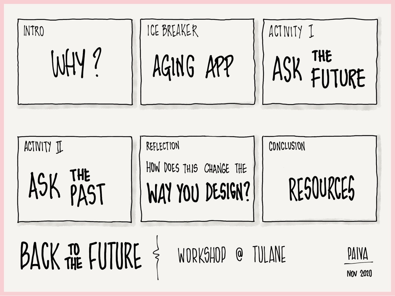
  • A six-frame storyboard for a workshop called Back to the Future, held at Tulane in November 2020. The frames run intro why, ice breaker aging app, activity one ask the future, activity two ask the past, reflection how does this change the way you design, and conclusion resources.

Portfolio

This is a printed portfolio, a book of selected work, laid out as one long page.

From top to bottom

  1. At the top, the site header: my name, which goes home, then links to Writing, Work, Signal, Tools and Resume, then Settings, where you choose the drawings, light or dark, and movement. Beside it is a button that pauses everything that moves.
  2. A cover: my name, a paragraph on what I do, a contents list of the seven sections, and how to reach me.
  3. Six projects, then sketches. Each section has a heading, a large picture, and notes on what I did.
  4. At the bottom, the footer: a note on how this site is built, links to Illustrations, Pens, Concepts and Accessibility, this Describe this page button, then GitHub, LinkedIn and email.

What you can do here

Look through selected work in one place.